The Divine Comedy is a trilogy written by Dante Alighieri in 1320 about his imagined travels through the many levels of Hell, Purgatory, and Heaven. From personal experience reading these books as a high school student hundreds of years after they were written, they can be confusing. I went into this project with the goal of aiding the reader’s understanding with my design.
To accomplish this, I have created a map of the afterlife. When the Inferno cover is turned upside-down and placed in line with the others, they line up to create a diagram of the many layers Dante traveled through. The imagery within the design tells the story of the contrapasso punishment or environment he witnessed along the way. For example, the ice texture on the outermost level of the Inferno cover represents the sinners who were frozen in ice.
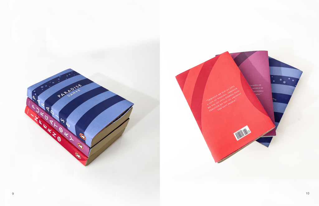
I chose a bold, unique font that I felt would stand out on a clean, monochrome background and a clear, legible serif font for body copy. I used center alignment throughout the whole piece and consistent alignment horizontally as well. This approach is very different from the high-contrast, dark, and traditional style of the existing cover designs for these books. This was very intentional because I felt that the covers needed a more modern look to appeal to younger readers.

Leave a comment